library(ggplot2)
library(rpact)
packageVersion("rpact")Supplementing and Enhancing rpact’s Graphical Capabilities with ggplot2
Utilities
Means
Power simulation
Introduction
We will illustrate the generation of the plots by assessing the simulated Type I error rate of a group sequential and adaptive inverse normal design in a sample size recalculation setting. It is well known that the adaptive inverse normal designs in contrast to group sequential designs controls the overall Type I error rate even in a setting of sample size recalculation. The goal of this exercise is to present this fact in a single comprehensive output.
With rpact, the necessary components can be conveniently calculated: We will analyze both design choices by rpact, retrieve the results and arrange them by the means of ggplot2.
Loading the packages
We start by loading the required two packages.
The automatic markdown feature of rpact must be disabled for plots (otherwise, combining rpact plot objects with ggplot2 commands will fail):
options("rpact.auto.markdown.plot" = FALSE)[1] '4.4.0'Initialize the group sequential and adaptive inverse normal design
After the two packages were loaded, the group sequential (dGS) and adaptive inverse normal (dIN) design can be generated. Throughout this document, we will use the default parameter settings from rpact.
dGS <- getDesignGroupSequential()
dIN <- getDesignInverseNormal()
We can now take a look into both designs and inspect their default values. These are identical outputs although the way of calculating the test statistics over the stages differ.
dGSDesign parameters and output of group sequential design
Default parameters
- Type of design: O’Brien & Fleming
- Maximum number of stages: 3
- Stages: 1, 2, 3
- Information rates: 0.333, 0.667, 1.000
- Significance level: 0.0250
- Type II error rate: 0.2000
- Futility bounds (non-binding): -Inf, -Inf
- Binding futility: FALSE
- Test: one-sided
- Tolerance: 0.00000001
Output
- Cumulative alpha spending: 0.0002592, 0.0071601, 0.0250000
- Critical values: 3.471, 2.454, 2.004
- Stage levels (one-sided): 0.0002592, 0.0070554, 0.0225331
dINDesign parameters and output of inverse normal combination test design
Default parameters
- Type of design: O’Brien & Fleming
- Maximum number of stages: 3
- Stages: 1, 2, 3
- Information rates: 0.333, 0.667, 1.000
- Significance level: 0.0250
- Type II error rate: 0.2000
- Futility bounds (non-binding): -Inf, -Inf
- Binding futility: FALSE
- Test: one-sided
- Tolerance: 0.00000001
Output
- Cumulative alpha spending: 0.0002592, 0.0071601, 0.0250000
- Critical values: 3.471, 2.454, 2.004
- Stage levels (one-sided): 0.0002592, 0.0070554, 0.0225331
In the output, we see some important characteristics like the type of design (OF = O’Brien and Fleming), the maximum number of stages (3), the information rates (0.333, 0.667, 1.000), the significance level (0.025) and the stage level information (0.0002592, 0.0070554, 0.0225331).
We can also easily plot the stage level information by means of rpact.
dGS |> plot(type = 3)
dIN |> plot(type = 3)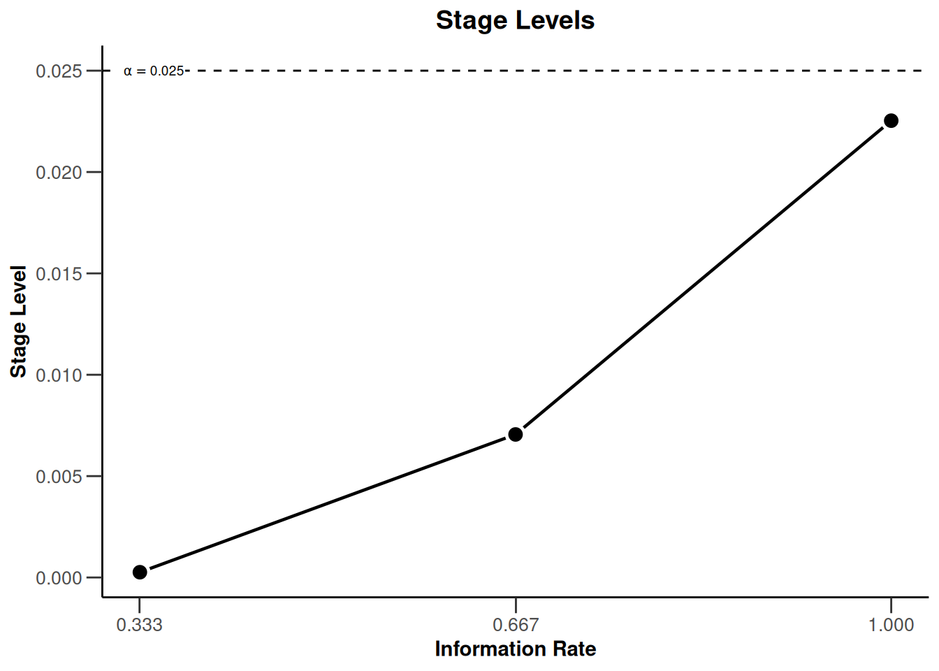
With these commands, rpact creates the plots that shows the three stage levels (0.0025, 0.0070554, 0.0225331) visually together with the corresponding information rates (0.333, 0.667, 1.000) and the significance level (0.025, dashed line).
Modification of the rpact base plots with ggplot2 (aesthetic) commands
We note that the plots for the two designs are identical. This is expected as the same boundary type (O’Brien and Fleming) was used for both designs. So, we might want to restrict ourselves to present only one stage level plot. Instead, we can include this information in a custom title. This is achieved by combining the rpact “base” plot with ggplot2 aesthetics commands as follows:
plot(dGS, type = 3) +
    ggtitle("Stage level plot of the adaptive and group sequential design")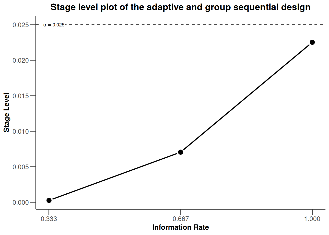
All ggplot2 aesthetic commands which modify an existing plot are initiated by a plus sign “+”. Thereafter, we can add the particular command in the ggplot2 language to specify how we want to modify the plot. Luckily, all rpact graphics are compatible with ggplot2.
Modifications are not restricted to additions to existing plots, as demonstrated by adding a new title, but they can also re-model the initial plot. For example, we can change the limits of the x- and y-axis post-hoc.
plot(dGS, type = 3) + xlim(0, 1) + ylim(0, dGS$alpha + 0.005)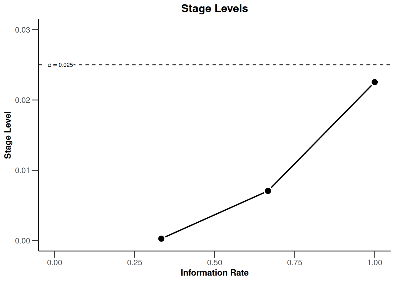
Or do both:
plot(dGS, type = 3) +
    ggtitle("Stage level plot of the adaptive and group sequential design") +
    xlim(0, 1) + ylim(0, dGS$alpha + 0.005)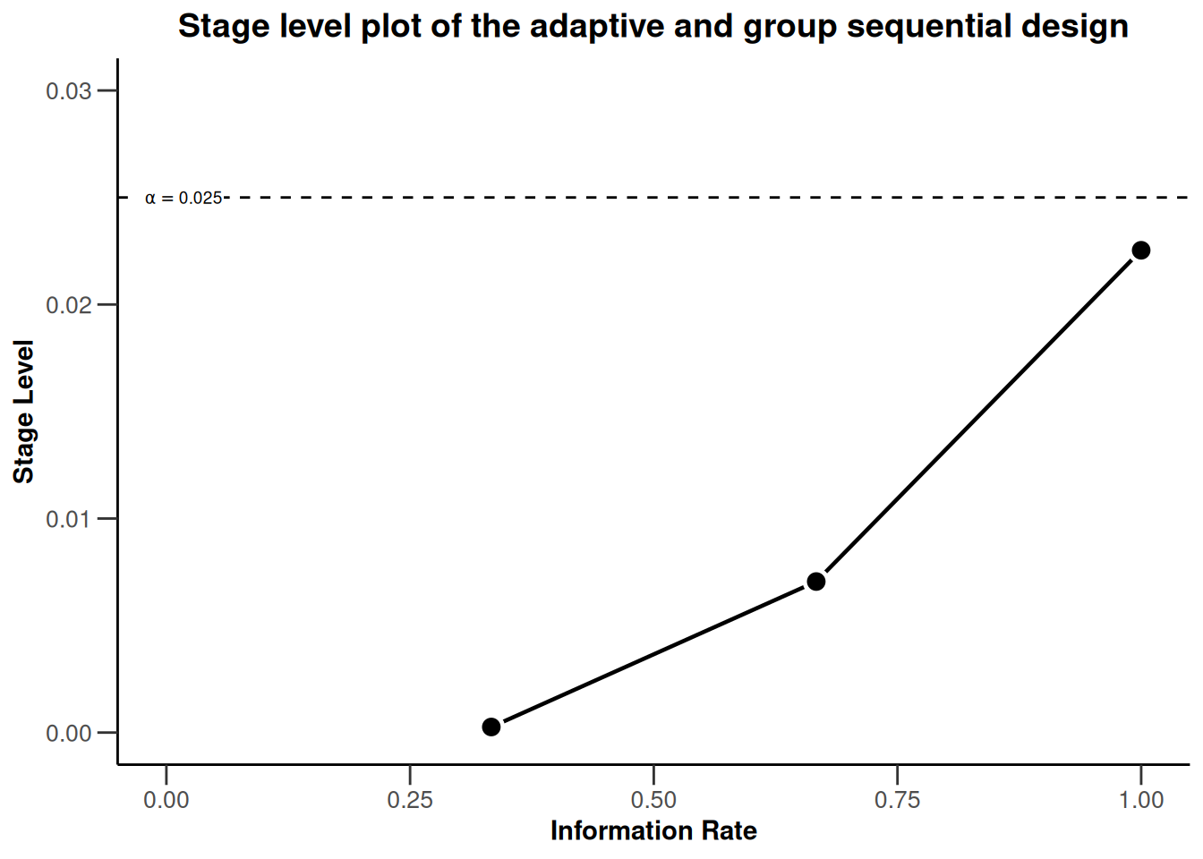
To make the plot more self-explanatory, we might want to further add
- a visual highlight for the significance level of a single stage design by using the
geom_pointandannotatecommands - a better visual illustration of the local stage levels by adding horizontal reference lines by using
geom_hlinecommands - color to the three different stages in the plot by using the aesthetic command
geom_point - the numerical values of the stage levels to plot by using appropriate
annotatecommands
plot(dGS, type = 3) +
    ggtitle("Stage level plot of the adaptive and group sequential design") +
    xlim(0, 1) + ylim(0, dGS$alpha + 0.005) +
    geom_point(aes(x = 1, y = dGS$alpha), colour = "red", size = 3) +
    annotate(
        geom = "text", label = "Final significance level of single-stage design",
        color = "red", x = dGS$informationRates[3], y = dGS$alpha, vjust = -2, hjust = 1
    ) +
    geom_hline(yintercept = dGS$stageLevels, linetype = "dashed", color = "grey") +
    geom_point(aes_(x = dGS$informationRates[1], y = dGS$stageLevels[1]),
        color = "blue", size = 3
    ) +
    geom_point(aes_(x = dGS$informationRates[2], y = dGS$stageLevels[2]),
        color = "green", size = 3
    ) +
    annotate(
        geom = "text", label = round(dGS$stageLevels[1], 5),
        x = dGS$informationRates[1], y = dGS$stageLevels[1], vjust = -2
    ) +
    annotate(
        geom = "text", label = round(dGS$stageLevels[2], 5),
        x = dGS$informationRates[2], y = dGS$stageLevels[2], vjust = -3
    ) +
    annotate(
        geom = "text", label = round(dGS$stageLevels[3], 5),
        x = dGS$informationRates[3], y = dGS$stageLevels[3], vjust = 4
    )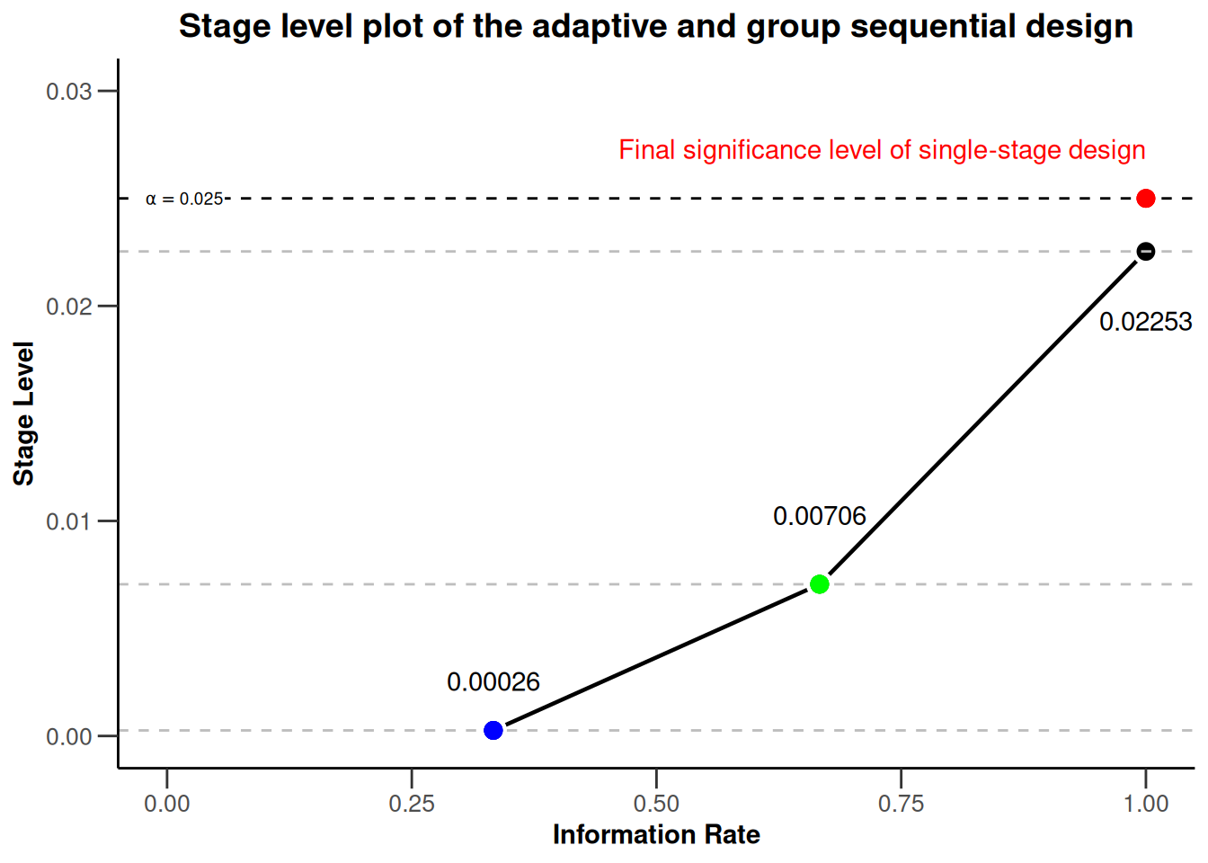
Note that the commands pull the required information directly from the design object and thus would automatically adjust to design changes like, for example, a switch to Pocock boundaries.
Illustrating Type I error control of adaptive designs with rpact and ggplot2
In the last part of this document, we investigate the Type I error rate of the chosen group sequential and adaptive inverse normal design in a sample size recalculation setting and present the simulation results visually in a plot.
Simulating the Type I error rate
Using getSimulationMeans(), we can easily simulate the operating characteristics of designs. To simulate the Type I error rate, we specify the null hypothesis as an alternative hypothesis with zero therapy effect (alternative = 0). The simulated overall rejection rate of the designs then corresponds to the Type I error rate.
We assume a scenario with two interim analyses after 20 and 40 subjects and a final analysis after 60 subjects. We allow for a recalculation of the sample size for the next stage based on a conditional power of 80%. The recalculated sample size per stage is limited to be between 20 and 80. We perform a total of 100’000 simulations to get sufficient precision for the simulated Type I error rate. The seed (seed = 12345) ensures that the simulated values can be reproduced, e.g., for documentation purposes. This is done for both the group sequential and the inverse normal design specification.
dGSsim <- getSimulationMeans(dGS,
    plannedSubjects = c(20, 40, 60),
    conditionalPower = 0.8, alternative = 0,
    minNumberOfSubjectsPerStage = c(20, 20, 20),
    maxNumberOfSubjectsPerStage = c(20, 80, 80),
    maxNumberOfIterations = 100000,
    seed = 12345
)
dGSsim |> summary()
Simulation of a continuous endpoint
Sequential analysis with a maximum of 3 looks (group sequential design), one-sided overall significance level 2.5%. The results were simulated for a two-sample t-test (normal approximation), H0: mu(1) - mu(2) = 0, power directed towards larger values, H1: effect = 0, standard deviation = 1, planned cumulative sample size = c(20, 40, 60), sample size reassessment: conditional power = 0.8, minimum subjects per stage = c(20, 20, 20), maximum subjects per stage = c(20, 80, 80), simulation runs = 100000, seed = 12345.
| Stage | 1 | 2 | 3 |
|---|---|---|---|
| Planned information rate | 33.3% | 66.7% | 100% |
| Cumulative alpha spent | 0.0003 | 0.0072 | 0.0250 |
| Stage levels (one-sided) | 0.0003 | 0.0071 | 0.0225 |
| Efficacy boundary (z-value scale) | 3.471 | 2.454 | 2.004 |
| Cumulative power | 0.0002 | 0.0090 | 0.0319 |
| Stage-wise number of subjects | 20.0 | 77.2 | 78.7 |
| Expected number of subjects under H1 | 175.1 | ||
| Conditional power (achieved) | 0.1282 | 0.0848 | |
| Exit probability for efficacy | 0.0002 | 0.0087 |
dINsim <- getSimulationMeans(dIN,
    plannedSubjects = c(20, 40, 60),
    conditionalPower = 0.8, alternative = 0,
    minNumberOfSubjectsPerStage = c(20, 20, 20),
    maxNumberOfSubjectsPerStage = c(20, 80, 80),
    maxNumberOfIterations = 100000,
    seed = 12345
)
dINsim |> summary()
Simulation of a continuous endpoint
Sequential analysis with a maximum of 3 looks (inverse normal combination test design), one-sided overall significance level 2.5%. The results were simulated for a two-sample t-test (normal approximation), H0: mu(1) - mu(2) = 0, power directed towards larger values, H1: effect = 0, standard deviation = 1, planned cumulative sample size = c(20, 40, 60), sample size reassessment: conditional power = 0.8, minimum subjects per stage = c(20, 20, 20), maximum subjects per stage = c(20, 80, 80), simulation runs = 100000, seed = 12345.
| Stage | 1 | 2 | 3 |
|---|---|---|---|
| Fixed weight | 0.577 | 0.577 | 0.577 |
| Cumulative alpha spent | 0.0003 | 0.0072 | 0.0250 |
| Stage levels (one-sided) | 0.0003 | 0.0071 | 0.0225 |
| Efficacy boundary (z-value scale) | 3.471 | 2.454 | 2.004 |
| Cumulative power | 0.0003 | 0.0070 | 0.0251 |
| Stage-wise number of subjects | 20.0 | 77.1 | 78.7 |
| Expected number of subjects under H1 | 175.3 | ||
| Conditional power (achieved) | 0.1280 | 0.0806 | |
| Exit probability for efficacy | 0.0003 | 0.0068 |
Extraction of the simulated Type I error rate of both designs
We can easily extract the simulated Type I error rate or overall rejection rates under the null hypothesis. This value is stored in the overallReject parameter of the simulation outputs.
dGSalpha <- dGSsim$overallReject
dGSalpha
[1] 0.03193dINalpha <- dINsim$overallReject
dINalpha[1] 0.02507The results of the simulation show that, in a setting of sample size recalculation, the group sequential design does not control the nominal significance level. The overall rejection rate of the group sequential design (0.03193) is larger than the significance level (0.025). The inverse normal design controls the Type I error rate as the overall rejection rate (0.02507) is close to the significance level of 0.025.
Final Plot
In the final plot of this example, we try to present the core learning of the previous section in a single overarching plot. The final plot should be management ready, meaning include all relevant information, be visually appealing and self-explanatory. The intention of the plot is to transfer the information that a group sequential design and adaptive inverse normal design with same parameters will feature the same stage levels at the corresponding information rates, the same overall significance level, but different overall rejection rates in a setting of sample size recalculation.
For the final plot, we start with all (plot and aesthetic) commands, which we used in the chapter Modification of the rpact base chart with ggplot2 (aesthetic) commands. Additional information from the simulation results are subsequently added in.
# create base ggplot object
createdPlot <- plot(dGS, type = 3)

# modify the rpact base plot as described above
createdPlot <- createdPlot +
    ggtitle("Stage level plot of the adaptive and group sequential design") +
    xlim(0, 1) + ylim(0, dGS$alpha + 0.005) +
    geom_point(aes(x = 1, y = dGS$alpha), colour = "red", size = 3) +
    annotate(
        geom = "text", label = "Final significance level of single-stage design",
        color = "red", x = dGS$informationRates[3], y = dGS$alpha, vjust = -2, hjust = 1
    ) +
    geom_hline(yintercept = dGS$stageLevels, linetype = "dashed", color = "grey") +
    geom_point(aes_(x = dGS$informationRates[1], y = dGS$stageLevels[1]),
        color = "blue", size = 3
    ) +
    geom_point(aes_(x = dGS$informationRates[2], y = dGS$stageLevels[2]),
        color = "green", size = 3
    ) +
    annotate(
        geom = "text", label = round(dGS$stageLevels[1], 5),
        x = dGS$informationRates[1], y = dGS$stageLevels[1], vjust = -2
    ) +
    annotate(
        geom = "text", label = round(dGS$stageLevels[2], 5),
        x = dGS$informationRates[2], y = dGS$stageLevels[2], vjust = -3
    ) +
    annotate(
        geom = "text", label = round(dGS$stageLevels[3], 5),
        x = dGS$informationRates[3], y = dGS$stageLevels[3], vjust = 4
    )

# add additional annotations
createdPlot <- createdPlot +
    annotate("text",
        x = 0.55, y = 0.016,
        label = paste("Group sequential design:", dGSalpha), hjust = 1
    ) +
    annotate("text",
        x = 0.55, y = 0.014,
        label = paste("Adaptive inverse normal design:", dINalpha), hjust = 1
    ) +
    annotate("text",
        x = 0.05, y = 0.010,
        label = paste("Based on", dGSsim$maxNumberOfIterations, "simulations."), hjust = 0
    ) +
    annotate("text",
        x = 0.05, y = 0.020,
        label = "Simulated overall Type I error rate with sample size recalculation:", hjust = 0
    )

# generate and show plot
createdPlot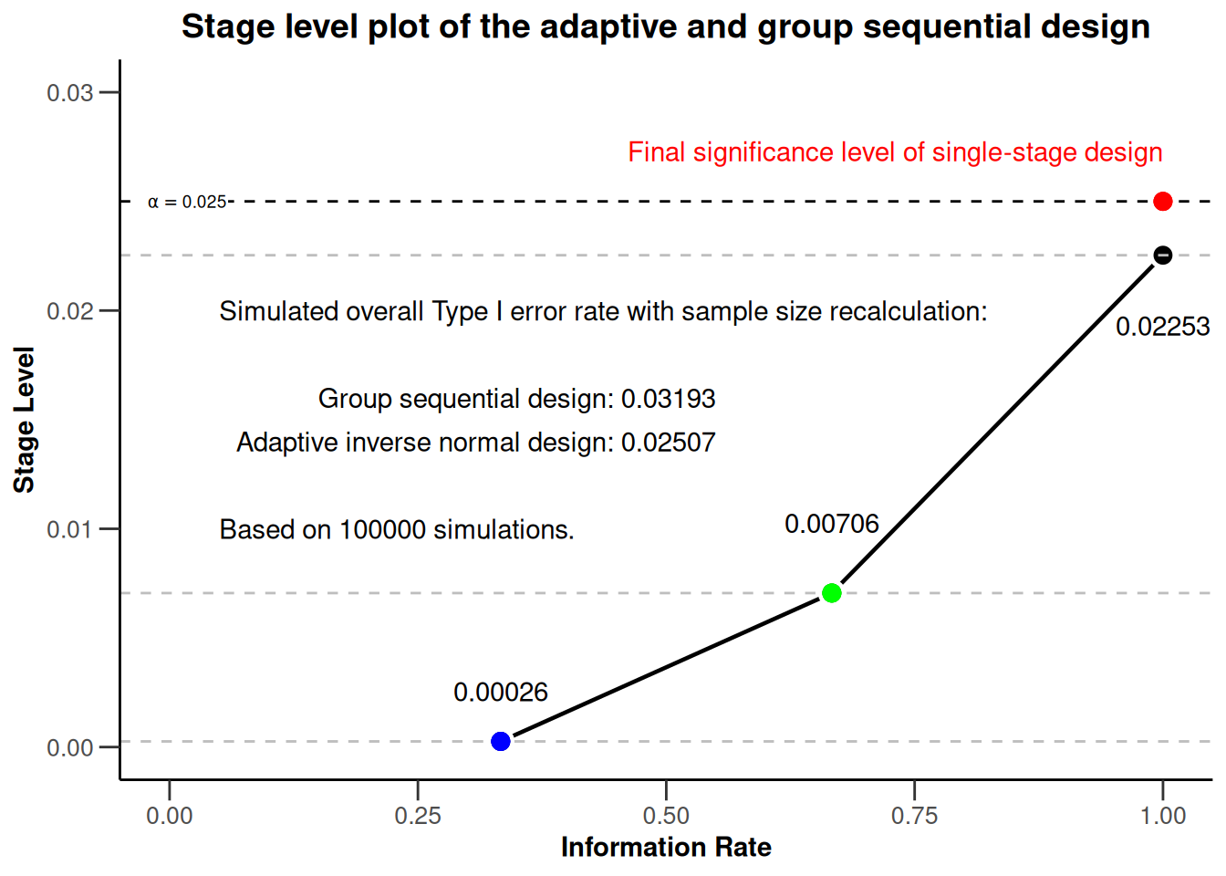
Summary
It was shown that rpact “base” charts can be modified with standard ggplot2 commands. The implementation is very easy and intuitive as it follows the normal ggplot2 syntax. The authors hope that this information is helpful for everyone who wants to further modify graphical outputs from rpact.
References
Gernot Wassmer and Werner Brannath, Group Sequential and Confirmatory Adaptive Designs in Clinical Trials, Springer 2016, ISBN 978-3319325606
R-Studio, Data Visualization with ggplot2 - Cheat Sheet, version 2.1, 2016, https://www.rstudio.com/wp-content/uploads/2016/11/ggplot2-cheatsheet-2.1.pdf
Disclaimer
Yannic Schmidt, Stefan Englert and Martina Kron are employees of AbbVie Inc. Gernot Wassmer and Friedrich Pahlke are employees of RPACT (R Programming for Adaptive Clinical Trials). All opinions and information in this presentation are from the authors and do not necessarily reflect the views of their employers.
System: rpact 4.4.0, R version 4.6.0 (2026-04-24), platform: x86_64-pc-linux-gnu
To cite R in publications use:
R Core Team (2026). R: A Language and Environment for Statistical Computing. R Foundation for Statistical Computing, Vienna, Austria. doi:10.32614/R.manuals https://doi.org/10.32614/R.manuals. https://www.R-project.org/.
To cite package ‘rpact’ in publications use:
Wassmer G, Pahlke F (2026). rpact: Confirmatory Adaptive Clinical Trial Design and Analysis. R package version 4.4.0. doi:10.32614/CRAN.package.rpact
Wassmer G, Brannath W (2025). Group Sequential and Confirmatory Adaptive Designs in Clinical Trials, 2nd edition. Springer, Cham, Switzerland. ISBN 978-3-031-89668-2. doi:10.1007/978-3-031-89669-9 https://doi.org/10.1007/978-3-031-89669-9.