library(rpact)
packageVersion("rpact") Planning a Trial with Binary Endpoints with rpact
Planning
Rates
Sample size
Power simulation
This document provides an example for planning a trial with a binary endpoint using rpact. It also illustrates the use of ggplot2 for illustrating the characteristics of a sample size recalculation strategy. Another example for planning a trial with binary endpoints can be found in the vignette Designing group sequential trials with a binary endpoint with rpact.
Designing a trial with binary endpoints
First, load the rpact package
[1] '4.4.0.9305'Suppose a trial should be conducted in 3 stages where at the first stage 50%, at the second stage 75%, and at the final stage 100% of the information should be observed. O’Brien & Fleming boundaries are to be used with one-sided \(\alpha = 0.025\) and non-binding futility bounds 0 and 0.5 for the first and the second stage, respectively, on the \(z\)-value scale.
The endpoints are binary (failure rates) and should be compared in a parallel group design, i.e., the null hypothesis to be tested is \(H_0:\pi_1 - \pi_2 = 0\,,\) which is tested against the alternative \(H_1: \pi_1 - \pi_2 < 0\,.\)
Sample size calculation
The necessary sample size to achieve 90% power if the failure rates are assumed to be \(\pi_1 = 0.40\) for the treatment group and \(\pi_2 = 0.60\) for the control group can be obtained as follows:
dGS <- getDesignGroupSequential(
    informationRates = c(0.5, 0.75, 1), alpha = 0.025, beta = 0.1,
    futilityBounds = c(0, 0.5)
)
r <- getSampleSizeRates(dGS, pi1 = 0.4, pi2 = 0.6)
The summary() command creates a nice table for the study design parameters:
r |> summary()Sample size calculation for a binary endpoint
Sequential analysis with a maximum of 3 looks (group sequential design), one-sided overall significance level 2.5%, power 90%. The results were calculated for a two-sample test for rates (normal approximation), H0: pi(1) - pi(2) = 0, H1: pi(1) = 0.4, control rate pi(2) = 0.6.
| Stage | 1 | 2 | 3 |
|---|---|---|---|
| Planned information rate | 50% | 75% | 100% |
| Cumulative alpha spent | 0.0021 | 0.0105 | 0.0250 |
| Stage levels (one-sided) | 0.0021 | 0.0097 | 0.0215 |
| Efficacy boundary (z-value scale) | 2.863 | 2.337 | 2.024 |
| Futility boundary (z-value scale) | 0 | 0.500 | |
| Efficacy boundary (t) | -0.248 | -0.165 | -0.124 |
| Futility boundary (t) | 0.000 | -0.035 | |
| Cumulative power | 0.2958 | 0.6998 | 0.9000 |
| Number of subjects | 133.1 | 199.7 | 266.3 |
| Expected number of subjects under H1 | 198.3 | ||
| Overall exit probability (under H0) | 0.5021 | 0.2275 | |
| Overall exit probability (under H1) | 0.3058 | 0.4095 | |
| Exit probability for efficacy (under H0) | 0.0021 | 0.0083 | |
| Exit probability for efficacy (under H1) | 0.2958 | 0.4040 | |
| Exit probability for futility (under H0) | 0.5000 | 0.2191 | |
| Exit probability for futility (under H1) | 0.0100 | 0.0056 |
Legend:
- (t): treatment effect scale
Note that the calculation of the efficacy (and futility) boundaries on the treatment effect scale is performed under the assumption that \(\pi_2 = 0.60\) is the observed failure rate in the control group and states the treatment difference to be observed in order to reach significance (or stop the trial due to futility).
Optimum allocation ratio
The optimum allocation ratio yields the smallest overall sample size and depends on the choice of \(\pi_1\) and \(\pi_2\). It can be obtained by specifying allocationRatioPlanned = 0. In our case, due to \(\pi_1 = 1 - \pi_2\), the optimum allocation ratio is 1. However, since it is calculated numerically, the value slightly deviates from 1:
r <- getSampleSizeRates(dGS, pi1 = 0.4, pi2 = 0.6, allocationRatioPlanned = 0)
r$allocationRatioPlanned
[1] 0.9999976round(r$allocationRatioPlanned, 5)[1] 1Boundary plots
The decision boundaries can be illustrated on different scales.
On the \(z\)-value scale:
r |> plot(type = 1)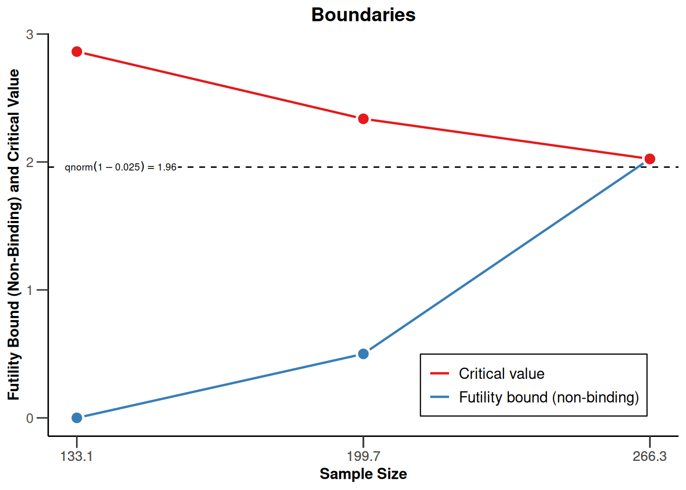
On the effect size scale:
r |> plot(type = 2)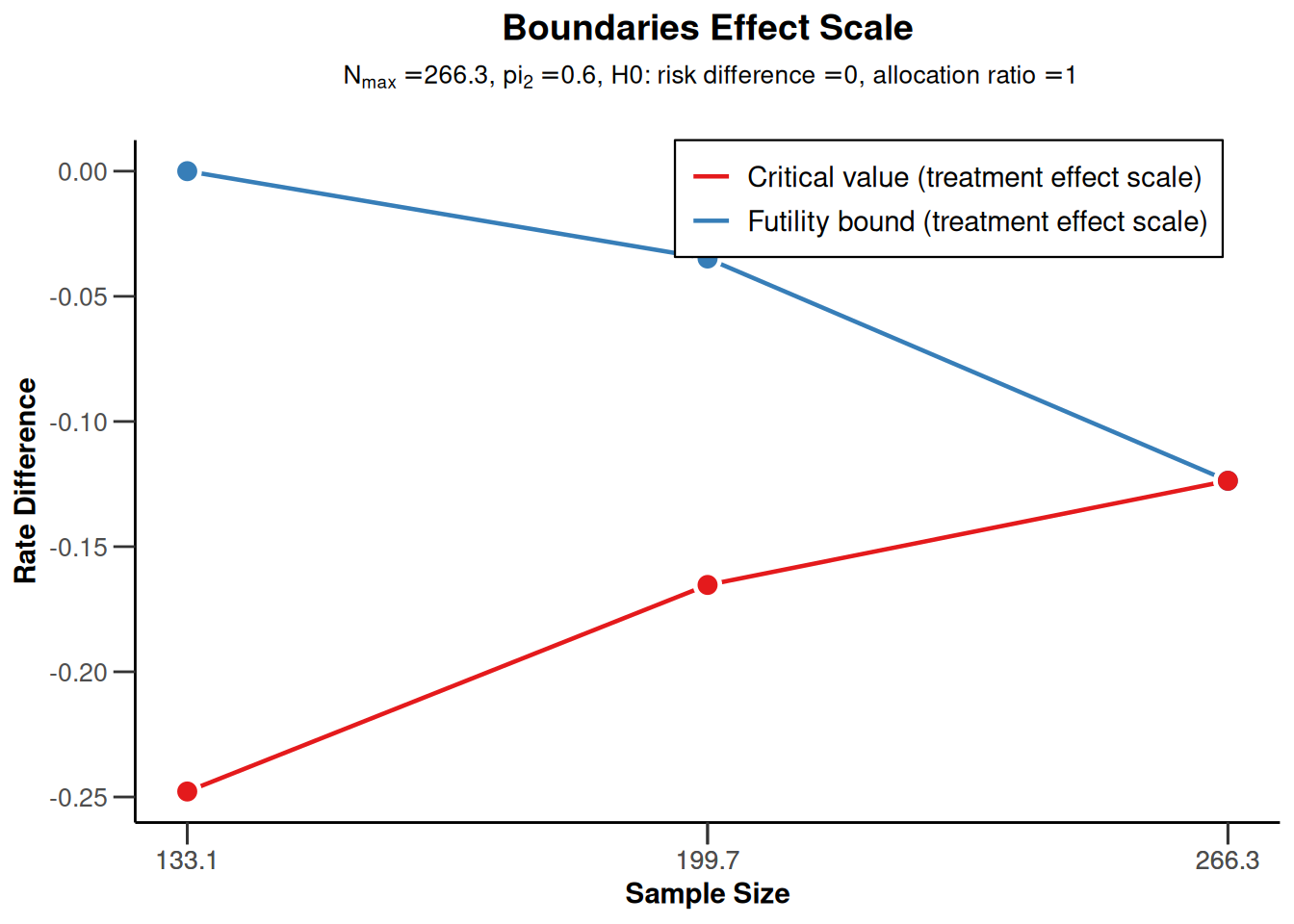
On the \(p\)-value scale:
r |> plot(type = 3)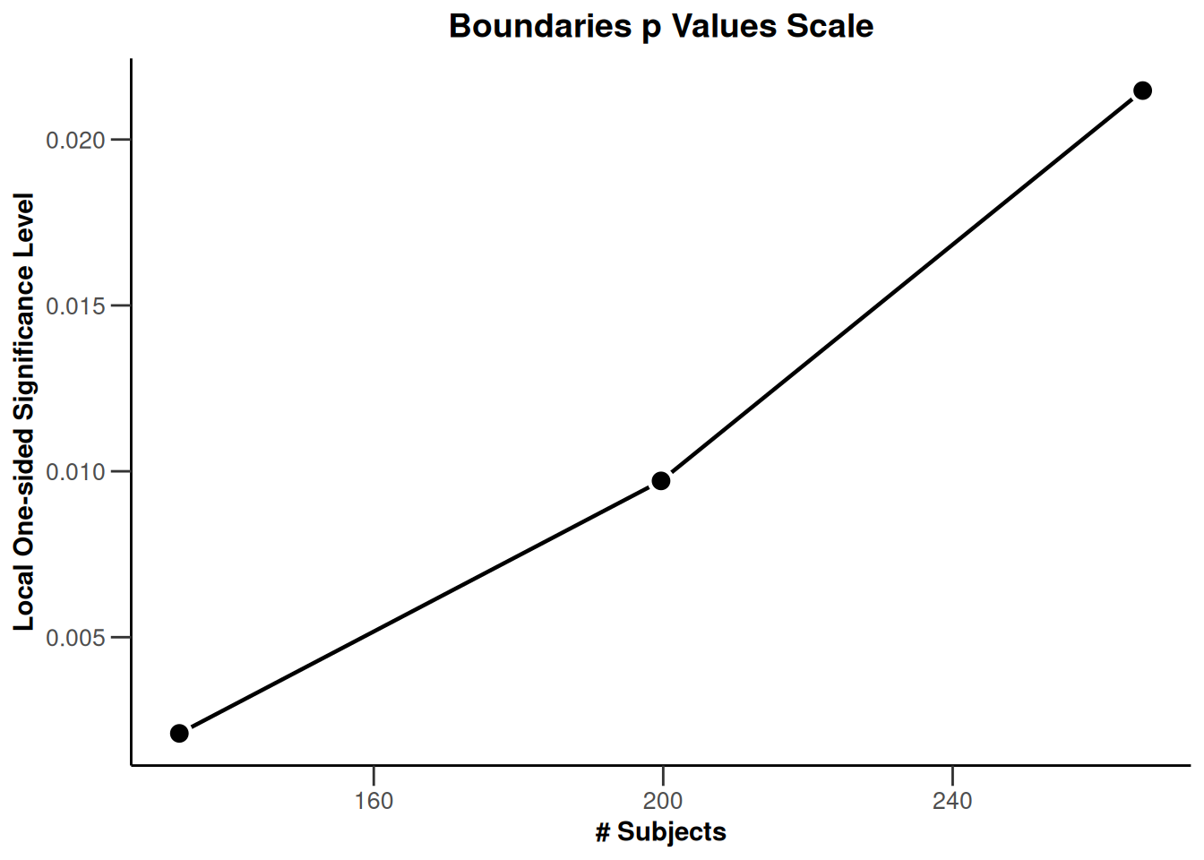
Power assessment
Suppose that a total of \(N = 280\) subjects were planned for the study. The power if the failure rate in the active treatment group is \(\pi_1 = 0.40\) or \(\pi_1 = 0.50\) can be achieved as follows:
power <- getPowerRates(dGS,
    maxNumberOfSubjects = 280,
    pi1 = c(0.4, 0.5), pi2 = 0.6, directionUpper = FALSE
)
power$overallReject
[1] 0.914045 0.377853Note that directionUpper = FALSE is used because the study is powered for alternatives \(\pi_1 - \pi_2\) being smaller than 0.
The power for \(\pi_1 = 0.50\) (37.8%) is greatly reduced as compared to the case \(\pi_1 = 0.40\) (where it exceeds 90%).
Graphical illustration
We also can graphically illustrate the power, the expected sample size, and the early stopping and futility stopping probabilities for a range of alternative values. This can be done by specifying the lower and the upper bound for \(\pi_1\) in getPowerRates() and using the generic plot() command with type = 6:
power <- getPowerRates(dGS,
    maxNumberOfSubjects = 280,
    pi1 = c(0.3, 0.6), pi2 = 0.6, directionUpper = FALSE
)
power |> plot(type = 6)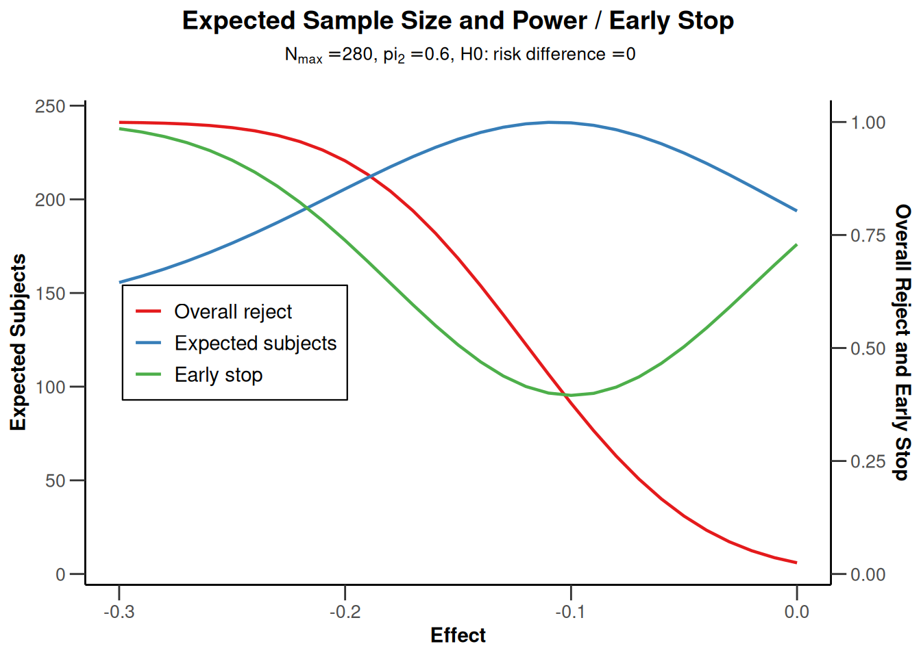
Note that the futility boundaries are treated as binding when calculating the probability of early stopping, even though they were specified to be non-binding.
Sample size reassessment (SSR) for testing rates
Suppose that, using an adaptive design, the sample size from the above example can be increased in the last interim up to a 4-fold of the originally planned sample size for the last stage. A target conditional power of 90% based on the observed effect sizes (failure rates) should be used to increase the sample size. We want to use the inverse normal method to allow for the sample size increase and compare the test characteristics with the group sequential design from the above example.
Assess power
To assess the test characteristics of this adaptive design, we first define the inverse normal design and then perform two simulations, one without and one with SSR:
dIN <- getDesignInverseNormal(
    informationRates = c(0.5, 0.75, 1),
    alpha = 0.025, beta = 0.1, futilityBounds = c(0, 0.5)
)

sim1 <- getSimulationRates(dIN,
    plannedSubjects = c(140, 210, 280),
    pi1 = seq(0.4, 0.5, 0.01), pi2 = 0.6, directionUpper = FALSE,
    maxNumberOfIterations = 1000, conditionalPower = 0.9,
    minNumberOfSubjectsPerStage = c(140, 70, 70),
    maxNumberOfSubjectsPerStage = c(140, 70, 70), seed = 1234
)

sim2 <- getSimulationRates(dIN,
    plannedSubjects = c(140, 210, 280),
    pi1 = seq(0.4, 0.5, 0.01), pi2 = 0.6, directionUpper = FALSE,
    maxNumberOfIterations = 1000, conditionalPower = 0.9,
    minNumberOfSubjectsPerStage = c(NA, 70, 70),
    maxNumberOfSubjectsPerStage = c(NA, 70, 4 * 70), seed = 1234
)
Note that the sample sizes will be calculated under the assumption that the conditional power for the subsequent stage is 90%. If the resulting sample size is larger, the upper bound (4*70 = 280) is used.
Note also that sim1 can also be calculated using getPowerRates() or can also be simulated more easily without specifying conditionalPower, minNumberOfSubjectsPerStage, and maxNumberOfSubjectsPerStage (which obviously is redundant for sim1) but this way ensures that the calculated objects sim1 and sim2 contain exactly the same parameters and therefore can be combined more easily (see below). The first elements of the vectors minNumberOfSubjectsPerStage and maxNumberOfSubjectsPerStage are not taken into account (since adaptations of the first-stage sample size are not permitted).
We can look at the power and the expected sample size of the two procedures and assess the power gain of using the adaptive design which comes along with an increased expected sample size:
sim1$pi1 # Treatment rate [1] 0.40 0.41 0.42 0.43 0.44 0.45 0.46 0.47 0.48 0.49 0.50round(sim1$overallReject, 3) # Power of sim1 [1] 0.921 0.890 0.853 0.810 0.752 0.721 0.675 0.582 0.526 0.469 0.405round(sim2$overallReject, 3) # Power of sim2 [1] 0.976 0.971 0.940 0.912 0.882 0.869 0.800 0.718 0.695 0.601 0.475round(sim1$expectedNumberOfSubjects, 1) # Average sample size of sim1 [1] 202.1 209.3 216.4 219.5 222.0 230.9 231.1 238.3 234.2 237.9 236.5round(sim2$expectedNumberOfSubjects, 1) # Average sample size of sim2 [1] 240.7 251.6 270.6 278.8 286.6 305.8 323.8 330.9 336.4 336.8 349.3Illustrate power difference
We now want to graphically illustrate the gain in power when using the adaptive sample size recalculation. We use ggplot2 (see ggplot2.tidyverse.org) for doing this. First, a dataset df combining sim1and sim2 is defined with the additional variable SSR. Defining mytheme and using the following ggplot2 commands, the difference in power and ASN of the two strategies is illustrated. The illustration shows that for effect differences below -0.15, an overall power which exceeds around 85% can be achieved with the proposed sample size recalculation strategy.
library(ggplot2)

dataSim1 <- as.data.frame(sim1, niceColumnNamesEnabled = FALSE)
dataSim2 <- as.data.frame(sim2, niceColumnNamesEnabled = FALSE)

dataSim1$SSR <- rep("no SSR", nrow(dataSim1))
dataSim2$SSR <- rep("SSR", nrow(dataSim2))
df <- rbind(dataSim1, dataSim2)

myTheme <- theme(
    axis.title.x = element_text(size = 12), axis.text.x = element_text(size = 12),
    axis.title.y = element_text(size = 12), axis.text.y = element_text(size = 12),
    plot.title = element_text(size = 14, hjust = 0.5),
    plot.subtitle = element_text(size = 12, hjust = 0.5)
)

p <- ggplot(
    data = df,
    aes(x = effect, y = overallReject, group = SSR, color = SSR)
) +
    geom_line(size = 1.1) +
    geom_line(aes(
        x = effect, y = expectedNumberOfSubjects / 400,
        group = SSR, color = SSR
    ), size = 1.1, linetype = "dashed") +
    scale_y_continuous("Power",
        sec.axis = sec_axis(~ . * 400, name = "ASN"),
        limits = c(0.2, 1)
    ) +
    xlab("effect") +
    ggtitle("Power and ASN", "Power solid, ASN dashed") +
    geom_hline(size = 0.5, yintercept = 0.8, linetype = "dotted") +
    geom_hline(size = 0.5, yintercept = 0.9, linetype = "dotted") +
    geom_vline(size = 0.5, xintercept = c(-0.2, -0.15), linetype = "dashed") +
    theme_classic() +
    myTheme

p |> plot()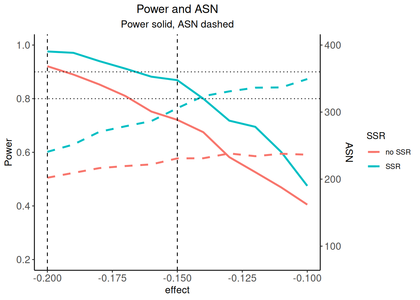
For saving the graph, use
ggplot2::ggsave(filename = "c:/yourdirectory/comparison.png", plot = ggplot2::last_plot(), device = NULL, path = NULL, scale = 1.2, width = 20, height = 12, units = "cm", dpi = 600, limitsize = TRUE)
For additional examples of using ggplot2 in rpact see also the vignette Supplementing and enhancing rpact’s graphical capabilities with ggplot2.
Histogram of sample sizes
Finally, we create a histogram for the attained sample size of the study when using the adaptive sample size recalculation.
With the getData() command, the simulation results are obtained and str(simdata) provides information of the structure of this data:
simData <- sim2 |> getData()
simData |> str()
'data.frame': 24579 obs. of 19 variables:
$ iterationNumber : num 1 2 2 2 3 3 4 4 4 5 ...
$ stageNumber : num 1 1 2 3 1 2 1 2 3 1 ...
$ pi1 : num 0.4 0.4 0.4 0.4 0.4 0.4 0.4 0.4 0.4 0.4 ...
$ pi2 : num 0.6 0.6 0.6 0.6 0.6 0.6 0.6 0.6 0.6 0.6 ...
$ numberOfSubjects : num 140 140 70 147 140 70 140 70 91 140 ...
$ numberOfCumulatedSubjects: num 140 140 210 357 140 210 140 210 301 140 ...
$ rejectPerStage : num 1 0 0 1 0 1 0 0 1 1 ...
$ futilityPerStage : num 0 0 0 0 0 0 0 0 0 0 ...
$ testStatistic : num 3.05 2.03 2.07 4.07 2.03 ...
$ testStatisticsPerStage : num 3.054 2.028 0.718 4.547 2.029 ...
$ overallRate1 : num 0.329 0.414 0.438 0.369 0.429 ...
$ overallRate2 : num 0.586 0.586 0.581 0.607 0.6 ...
$ stagewiseRates1 : num 0.329 0.414 0.486 0.27 0.429 ...
$ stagewiseRates2 : num 0.586 0.586 0.571 0.644 0.6 ...
$ sampleSizesPerStage1 : num 70 70 35 74 70 35 70 35 46 70 ...
$ sampleSizesPerStage2 : num 70 70 35 73 70 35 70 35 45 70 ...
$ trialStop : logi TRUE FALSE FALSE TRUE FALSE TRUE ...
$ conditionalPowerAchieved : num NA NA 0.602 0.9 NA ...
$ pValue : num 0.00112984 0.02126124 0.23628281 0.00000272 0.02121903 ...Depending on \(\pi_1\) (in this example, for \(\pi_1 = 0.5\)), you can create the histogram of the simulated total sample size as follows:
simDataPart <- simData[simData$pi1 == 0.5, ]

overallSampleSizes <-
    sapply(1:1000, function(i) {
        sum(simDataPart[simDataPart$iterationNumber == i, ]$numberOfSubjects)
    })

hist(overallSampleSizes, main = "Histogram", xlab = "Achieved sample size")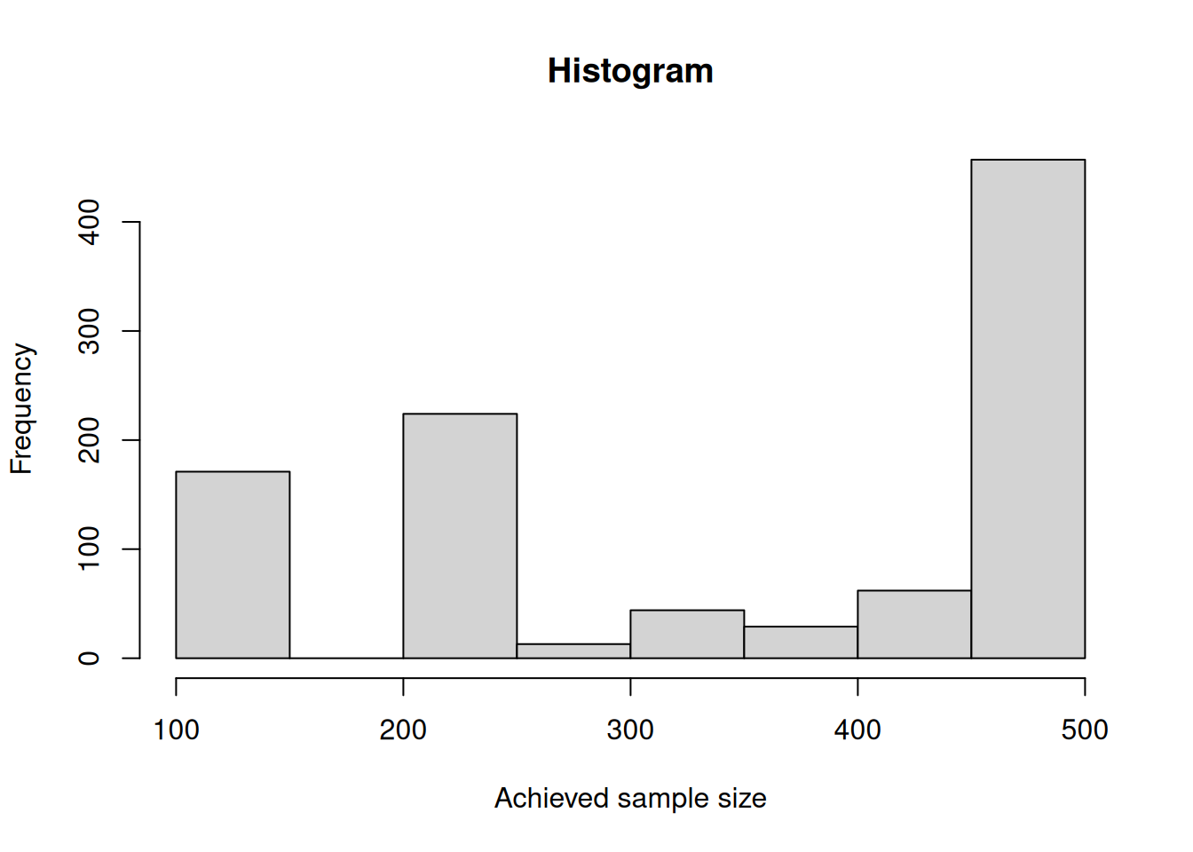
Percentages on how often the maximum and other sample sizes are reached over the stages can be obtained as follows:
subjectsRange <- cut(simDataPart$numberOfSubjects, c(69, 70, 139, 140, 210, 279, 280),
    labels = c(
        "(69,70]", "(70,139]", "(139,140]",
        "(140,210]", "(210,279]", "(279,280]"
    )
)

kable(round(prop.table(table(simDataPart$stageNumber, subjectsRange), margin = 1) * 100, 1))| (69,70] | (70,139] | (139,140] | (140,210] | (210,279] | (279,280] |
|---|---|---|---|---|---|
| 0 | 0.0 | 100.0 | 0.0 | 0.0 | 0.0 |
| 100 | 0.0 | 0.0 | 0.0 | 0.0 | 0.0 |
| 0 | 9.1 | 0.3 | 7.9 | 7.1 | 75.5 |
For this simulation, the originally planned sample size (70) was never selected for the third stage and in most cases, the maximum of sample size (280) was used.
References
Gernot Wassmer and Werner Brannath, Group Sequential and Confirmatory Adaptive Designs in Clinical Trials, Springer 2016, ISBN 978-3319325606
R-Studio, Data Visualization with ggplot2 - Cheat Sheet, version 2.1, 2016, https://www.rstudio.com/wp-content/uploads/2016/11/ggplot2-cheatsheet-2.1.pdf
System: rpact 4.4.0.9305, R version 4.6.0 (2026-04-24), platform: x86_64-pc-linux-gnu
To cite R in publications use:
R Core Team (2026). R: A Language and Environment for Statistical Computing. R Foundation for Statistical Computing, Vienna, Austria. doi:10.32614/R.manuals https://doi.org/10.32614/R.manuals. https://www.R-project.org/.
To cite package ‘rpact’ in publications use:
Wassmer G, Pahlke F (2026). rpact: Confirmatory Adaptive Clinical Trial Design and Analysis. R package version 4.4.0.9305. doi:10.32614/CRAN.package.rpact
Wassmer G, Brannath W (2025). Group Sequential and Confirmatory Adaptive Designs in Clinical Trials, 2nd edition. Springer, Cham, Switzerland. ISBN 978-3-031-89668-2. doi:10.1007/978-3-031-89669-9 https://doi.org/10.1007/978-3-031-89669-9.